Tailored learning for different devices
Elearning is a process that has a heavy emphasis on the end user. This is an important thing to keep in mind when devising an elearning platform.
Learners are accessing the internet on a myriad of devices from smartphones and tablets, to the more traditional laptop or desktop computer.
This does present new frontiers for elearning practices and it’s important to provide a user experience (UX) that’s bespoke and tailored to the learner themselves. Elearning should provide learners with a bespoke experience and one that fits with their specific learning needs and their exact device usage.
It can’t really be approached as a one size fits all type of thing and this is true of the lesson plans too. Learners should feel that they are working at their own rate, on their own devices, and with their own specific goals.
Same needs, different devices
In general, learners like to use desktop options when it comes to their elearning approaches; however, when they’re on the move they’re happier using their smartphones or other portable devices. The point is that different learners require the exact same level of structure and lesson planning, but there are different ways that learners approach and interact with the information. Reflect those differences and provide a good and consistent approach to your learning options on the devices and platforms that suit the learners (and the target devices) themselves.
Let’s consider some ways that your business can make its elearning platforms accessible to the most devices.
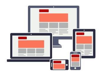
Responsive design
Responsive design is simple enough; it allows a website to rescale its size according to the device (and its screen size) used to access it.
Responsive design will rescale and resize your website for smaller screens but smartphones are entirely different devices to desktop computers. Resizing the website may not be enough and it may not really provide any sort of increase in functionality. There will be plenty of interactions that work really well on a desktop platform that simple won’t translate across to the smaller smartphone screen.
However, this can be overcome with specifically designed courses that are not too heavy on written content for smaller screens. Quizzes and gamified options are a good choice for responsive platforms.
Tools like the Adapt elearning framework can go a little further and actually alter some interactions on different devices, for example pop-ups become sliders.
Effectively, adaptive design is alternative interactions for specific content that depends on the device used to access it. So a smartphone user would experience a different layout and level of usability when compared to a desktop user’s experience of the same content. The best part about adaptive design is that if it’s implemented correctly users won’t even notice the different layout – their device will simply use the correct variant.
The problem has often been that websites have been scaled down to suit smaller screens instead of a bespoke and specific user experience. Now however a business can use responsive or adaptive design options to ensure that the user has the best possible experience whilst accessing learning resources.
It’s for the user
This is the best statement to keep in mind and it should function as your guiding light. The end user needs to be able to access the learning resources from whatever device and they must be engaged. Perhaps the easiest way to ensure that those things happen is to focus on the user experience (UX).
This isn't a new concept or a new pursuit but when it comes to elearning it’s very important. Good user design and clean interfaces will allow learners to get on with learning without cluttered screens and without the hassle. It will allow them to interact much more effectively and find that their learning is a much more enjoyable process.
User design isn't just the graphics or the technology; it’s about making the experience as bespoke and unique to the learner as possible. They should feel in control of their interactions and their learning. Your learners should never feel lost or find it difficult to source information from your learning platforms. UX has been an important part of design for some time now, but mobile has forced it back into the limelight in recent years and it exists for a reason. Users must not be made to think too hard about what they have to do in order to navigate the elearning platform, or they won’t engage with it.
The benefits of tailored learning
Tailored learning allows you to reach more learners than ever before. Now you can reach your entire employee pool easily and with the exact same content. The best part about the tailored approach however is the fact that you can tweak content for specific devices without any loss in the contents voracity.
The fact that mobile devices are increasing in their prevalence and that those mobile devices are pretty much always on and always within arms reach means that learning can truly become a constant and consistent part of your employee’s lives.