Sponge's 5 golden rules for good visual design in developing elearning
Good visual design encourages learners to engage with elearning content and absorb the key facts. It attracts attention, creates an all-important first impression and positively affects the way in which learners absorb information.
Good design helps to make the learning useful and, conversely, bad design can make it ineffective. It is not enough for the course to simply look good, the design sets the overall tone and communicates the message of the elearning.
The influential Bauhaus movement, which adopted the Gestalt Principles of visual logic in the early twentieth century, sowed the seeds of modern graphic design. These pioneers outlined the primary purposes of visual design which still hold true today. They are to:
- Create a clear visual hierarchy of contrast, so you can see at a glance what is important and what is peripheral
- Define functional regions of the page
- Group page elements that are related, so that you can see structure in the content
So how do these translate into elearning and what are the most important things to consider when designing your module to make it as effective as possible?
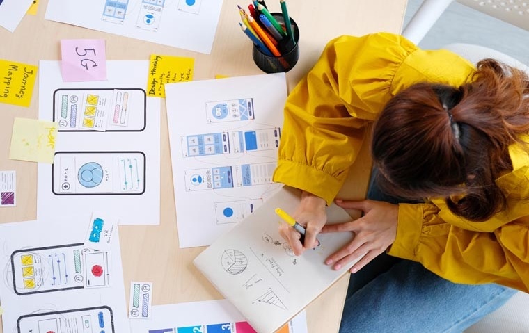
Below are five ‘golden rules’ that we apply to every one of our courses to help make sure our design is the best it can be.
Keep it simple
A cluttered page is confusing for learners. It can create mixed messages and prevent people from absorbing the key facts.
Influential product designer, Dieter Rams, said that ‘Good design is as little design as possible.’ and this principle certainly holds true for elearning, where the most effective designs are clean and simple. Don’t overload pages with content, instead identify critical information and focus on that. Having one key element on the page will ensure learners remember it rather than getting distracted. Design simple and intuitive navigation between sections with clear buttons and instruction so it is obvious what people have to do.
Remember that the design is communicating the message, not the message itself. You don’t want to distract from the purpose of the learning. For page layout, use a simple grid and familiar principles so the learner can easily predict where to find the key content and functional elements. A well-organised page with clear groups of content will allow for easy scanning.
Keep it consistent
Consistency gives the course a unified feel and pulls everything together, which is very important, particularly if the course is broken down into bite-size chunks. It’s essential to keep the same visual theme throughout the entire elearning course. Applying multiple styles and creative approaches will result in a confusing appearance and potentially distract learners from the content. Instead, use the same palette of colours throughout and fonts from the same family – you shouldn’t need more than five colours and a couple of fonts to create a good mix without seeming disjointed. Likewise all images should follow the same style, don’t switch between cartoon illustrations, photography and line drawings.
As well as aesthetic consistency, it’s important also to have behavioural consistency throughout the elearning. Buttons and methods of progression should always be the same on all page templates. Lack of consistency makes it look as though there’s no logic and creates more work for the user. This uniform approach to layout and navigation allows learners to adapt quickly to your design and to predict with confidence the location of key information and navigation controls.
Don’t be scared of whitespace
Whitespace doesn’t necessarily have to be white – often called negative space - it simply refers to the space on the page that is not filled with text or images. Whitespace helps learners to focus. It helps to avoid distractions by keeping the page layout clean and drawing the user’s focus to a particular screen element. It improves legibility and can actually help people to better understand what they are reading.
Research has shown that whitespace between paragraphs and around blocks of text can increase comprehension by as much as 20%. Good design has healthy margins, ample space between text and images and is well balanced.
Create a natural progression
The placement on the page needs to flow naturally from one element to another so that the learner’s eye moves through the information in the way you want. You want to attract the learner’s attention onwards through the pages; you don’t want them to access information in the wrong order because it’s not clear what they should be doing or to miss a key point.
Elements that are close to each other are perceived as more related than elements that lie farther apart. You also want to keep their attention on the course and not leave the screen so you don’t want the content to appear bitty.
Focus on the user experience
Attract the learner’s eye to the most important part of the page by making key elements larger or using contrasting colours. High contrasts can make features clearly stand out and create visual interest. Also put the most important information in the most prominent place – e.g. in most Western markets this will be the top left of the page. This will draw the learner’s eye in first, before they get distracted by another element.
Good design needs to be clear and readable so as well as ensuring you have enough space, it’s important to use easy to read fonts. Unlike in print design where ‘serif’ fonts are common, online reading is better with ‘sans serif’ fonts. Take a look at the example below to see the difference:
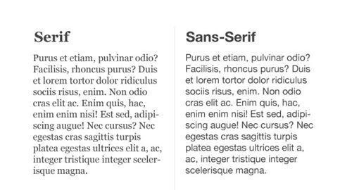
Typefaces with uniform strokes are good on screen and will still be legible at smaller sizes, making them more flexible across devices. Also, always make sure images and diagrams are relevant to the text they accompany on the page. If a chart actually relates to a piece of text at the bottom of the page rather than the section it’s next to, it will be confusing for the learner and spoil their experience.
As designers there are always more elements to consider and additional ideas to explore. These five statements are essential elements rather than a comprehensive list of design rules. However, they are a great place to start when considering elearning design and ensuring the effectiveness of an approach.
Author: Glen Harling, Senior Visual Designer at Sponge